

“Colors, like features, follow the changes of the emotions,” Pablo Picasso once remarked. Indeed, color is a powerful tool that can energize us or calm us down by triggering physiological and emotional responses. For example, bright red can literally raise our blood pressure and adrenaline levels, while soft blues might slow our heart rate (verywellmind.com). From ancient healing practices to modern marketing, people have long believed in the psychology of color – and science is now catching up to explain how the colors around us subtly shape our mood, behavior, and even our energy levels.
Color Psychology 101: Why Color Affects Us
Color psychology is the study of how different colors impact our feelings and actions. In ancient Egypt and China, healers practiced chromotherapy, using colored lights and pigments to treat ailments and emotions. Today, while some claims about color are exaggerated, researchers do find that color can convey information and influence mood in consistent ways. Warm colors like red and yellow often evoke high-arousal emotions (think excitement or anger), whereas cool colors like blue and green tend to be calming or somber.
Not all effects are universal – culture, context, and personal experience matter greatly. Still, a 2020 cross-cultural study of nearly 4,600 people found surprising consensus: yellow was linked with joy by 52% of respondents, red with love by 68%, and black with sadness by 51%, suggesting some color-emotion associations may be common to many people. Psychologists Andrew Elliot and Markus Maier noted in a review that despite color’s ubiquity, its influence on psychology has been understudied scientifically. But interest is growing as we recognize that a simple change of color in our surroundings can have a real, if subtle, impact on how we feel.
Warm vs. Cool: The Emotional Effects of Color
Color influences our emotions through both learned associations and direct biological responses. We often describe colors as “warm” (reds, oranges, yellows) or “cool” (blues, greens, purples), and these categories tend to produce different mood reactions across many cultures:
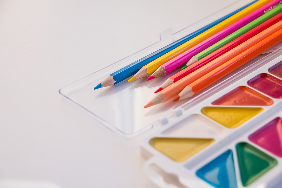
- Warm Colors (Red, Orange, Yellow): These hues are stimulating and attention-grabbing. Red is the most intense – it’s associated with passion, love, and urgency, but also anger and danger. It can literally stimulate the body, raising heart rate and blood flow (verywellmind.com). That’s one reason you’ll see red used for stop signs and emergency signals, as well as for romantic hearts. In marketing, red signals excitement and youth (think of Coca-Cola’s lively red branding). In everyday life, wearing red or adding a splash of red decor can make you feel bold and energized. However, too much red can also provoke stress or aggression in some cases (medicalxpress.com). Yellow is a warm, vibrant color linked to sunshine and optimism. It tends to evoke happiness and hope (medicalxpress.com). Many find that yellow décor brings a cheerful, positive vibe – but like any intense color, bright yellow can become overwhelming or anxiety-provoking if overused. Orange, a blend of red’s energy and yellow’s cheer, is often seen as friendly, extroverted, and creative. Orange can stimulate enthusiasm and conversation, which is why you might see it in social areas or creative studios. (In fact, color consultants often suggest a touch of orange or yellow in meeting rooms to encourage interaction and new ideas.)
- Cool Colors (Blue, Green, Purple): These hues generally have a calming or cooling effect on mood. Blue is commonly associated with peace, stability, and calm. Physiologically, blue light can even lower blood pressure and heart rate, helping induce relaxation (medicalxpress.com). Soft blue tones are used in many bedrooms, spas, and hospital rooms to create a serene environment. On the flip side, darker or desaturated blues can feel melancholy – hence phrases like “feeling blue.” Overall, blue is known as a color of intellect and tranquility, good for focus without being intrusive (medicalxpress.com). Green, with its strong ties to nature, conveys growth, freshness, and harmony. Studies show that exposure to green environments – even a brief glimpse of green – can reduce anxiety and have a relaxing effect on our bodies (medicalxpress.com). In one experiment, people who walked in a room bathed in green light had significantly lower heart rates than those in red or white light, confirming green’s calming power on the nervous system. Green is an excellent choice for spaces where you want balance and restoration (think of parks, or simply adding plants to your office). Purpleis often linked to creativity, mystery, and luxury. Historically it was the color of royalty and spirituality. Light purples (lavender, lilac) have a gentle, introspective feel that can be soothing, whereas bold violet or magenta can appear exotic or romantic. Because purple combines blue’s calm with red’s intensity, it’s a complex color – sometimes used in meditation spaces to inspire deep contemplation, other times used in products to signal luxury and imagination (Cadbury’s chocolate wrapping, for example, uses rich purple to imply decadence).
Our emotional reaction to a color also depends on personal context. A cool gray-blue might feel relaxing to one person but sad to another who associates it with dreary weather. Similarly, a bright red wall may energize some but irritate others. It’s important to note these individual differences even as we discuss general trends.
Science of Color and Performance: Focus, Creativity, and Appetite
Beyond general mood, colors can subtly influence cognitive performance and behavior. Psychologists are uncovering fascinating ways that the color of our surroundings or even the objects we use can impact our focus, creativity, and even appetite:
- Attention and Detail: If you have a task requiring accuracy (like editing a document or performing meticulous surgery), certain colors might give you an edge. In a notable study from the University of British Columbia, researchers found that people exposed to red did better on detail-oriented tasks, while those exposed to blue did better on creative tasks. Red cues seemed to heighten alertness and vigilance – participants viewing a red background on a computer were up to 31% more accurate on memory and proofreading tests compared to those viewing blue. Psychologists theorize that over time we’ve learned to associate red with warnings (think stop lights, red ink for errors) which triggers a cautious, detail-focused mindset. This can be useful in situations where you need to “jump into action” or avoid mistakes. However, the same high-alert state can backfire in creative or analytical work: another study showed that students who even saw a flash of red before an exam scored significantly lower, possibly due to anxiety or distraction. Blue, on the other hand, conjures images of open sky and ocean – symbols of peace and expansiveness. In the UBC study, a blue environment doubled the creative output of participants in brainstorming tasks compared to red. With blue fostering a sense of calm and security, people felt safe to daydream and take imaginative risks. Green may also be a secret creativity booster: a 2012 experiment showed that a brief glimpse of green improved creative performance on tasks, perhaps by unconsciously reminding people of growth and fertile ideas (pubmed.ncbi.nlm.nih.gov). So, if you need a innovation boost, a desk plant or a walk in the park might literally green-light your creativity!
- Productivity and Energy: Many offices are no longer sterile white boxes, and for good reason. Color design in workplaces aims to balance calm and stimulation. Blue is commonly used in corporate settings because it’s non-invasive and aids concentration for knowledge work. Tech companies and banks alike favor blue logos and interiors to convey trust and mental focus. Green accents (such as green walls, or even better, actual greenery) can reduce visual fatigue and stress during long work hours, contributing to better productivity. On the other hand, a pop of a warm color in an office can inject some energy – for instance, a splash of orange in a breakout room might spark enthusiasm during team discussions. It’s all about balance: too much excitation (imagine an entire office painted fire-engine red) could be distracting or stressful, but strategic dashes of warm hues against a cool or neutral background can keep spirits lively and minds alert. One fun finding: athletes and competitors might harness color psychology too. Studies have found that wearing red uniforms is linked to a higher chance of winning in sports, potentially because it boosts a sense of dominance or intimidates opponents – even referees tend to penalize players in black uniforms more harshly, suggesting our biases in perceiving color. While you may not be an athlete, it shows how color can unconsciously affect performance and social perception.
- Appetite and Eating Behavior: Ever noticed how fast-food restaurants often feature red, yellow, or orange in their branding and décor? That’s no accident. Warm colors are thought to stimulate the appetite and create a sense of urgency – exactly what a restaurant that wants quick customer turnover would desire. Red, in particular, is associated with hunger and cravings by many consumers (symega.com). It’s a color that says “excitement” and “act now,” which might encourage you to take that big bite of a burger or order an extra item. Yellow is similarly eye-catching and joyous, often used in combination with red (like the famous golden arches of McDonald’s) to invoke happiness and speed. Orange tones can make a dining environment feel cozy and social, which can lead to longer, more satisfying meals. Interestingly, some research suggests these effects might be as much learned as they are physiological – we associate red with sweet ripe fruits and yellow with sunny positive feelings, which can subconsciously make us more eager to eat (symega.com). Meanwhile, blue is rarely used on dining plates or restaurant walls because it’s considered the most appetite-suppressing color (few foods in nature are blue aside from berries). Some weight-loss advocates even suggest using blue plates to avoid overeating – the color might subtly signal the brain to be cautious or simply reduce visual appeal of the food. Science on this is mixed: one study found people actually ate less from red plates, possibly because red signaled them to stop snacking (edoc.unibas.ch). The key takeaway is that color sets a tone for eating. If you want a lively kitchen that encourages hearty meals and conversation, warm tones will help. If you’d rather your guests savor slowly, a cool, calm dining room with blues or greens might unconsciously encourage more mindful eating.
Color as Therapy: Using Hue for Relaxation and Wellness
Given color’s effects on the mind and body, it’s no surprise that many wellness practices consciously incorporate specific hues to promote healing. Color therapy, also known as chromotherapy, has regained popularity as people seek non-pharmaceutical ways to influence mood. Modern psychologists remain cautious – color isn’t a magic cure-all – but there is intriguing evidence that the right colors in the right context can support wellbeing:
- Stress Relief and Relaxation: One of the most straightforward therapeutic uses of color is to reduce stress. Cool colors, especially soft blues and greens, are the go-to for creating a relaxing atmosphere. In therapeutic settings and meditation rooms, blue is often used to foster a sense of tranquility. Studies even show that people with more exposure to natural blue (like ocean views) report lower stress and better mental health. Green, symbolizing nature, has a well-documented calming effect – psychologists talk about the “biophilia” hypothesis, which is our innate comfort in natural settings. Hospital designers use pale green walls or artwork of landscapes to help calm patients; research finds that hospital patients with a view of greenery may heal faster and require less pain medication than those without. Even short-term experiments back this up: in one study, intensive care nurses who sat in a chromotherapy room bathed in calm colors reported reduced compassion fatigue and trauma stress. At home, you can create a mini color therapy for stress relief by dimming the lights and using a blue-tinted lamp in the evening or soaking in a bath with gentle aqua green bath lights. These practices leverage the body’s natural relaxation response to cool colors. Aromatherapy spas often pair these hues with soothing scents to multiply the calming effect.
- Mood Disorders and Light Therapy: In more clinical approaches, certain wavelengths of color light are used to treat mood-related conditions. The most well-known is bright white light therapy for seasonal depression (SAD), but colored lights are being explored too. For example, some mental health clinics have experimented with Baker-Miller pink – a bubblegum pink shade – after early studies in the 1980s suggested it temporarily reduced aggression and anxiety. In correctional facilities, rooms painted pink reportedly calmed inmates for a short period, though the effect wears off as one adapts (and results have been mixed in follow-up research). Still, the idea that a specific color could influence hormone or neurotransmitter levels is fascinating. While mainstream psychology considers such targeted color therapies as complementary at best, many individuals swear by using colored glassesor LED light sessions to help with issues like insomnia (e.g. avoiding blue light at night) or low energy (using bright warm light in the morning). The consensus is that color can influence mood, but usually only short-term; for lasting therapy, it often works best alongside other treatments. Nevertheless, creating a comforting color environment is a simple way to boost your daily emotional health – it’s low risk, inexpensive, and you’ll immediately know if it makes you feel better.
- Spa and Wellness Design: Next time you walk into a spa or yoga studio, notice the colors. You’ll likely see a deliberate palette designed to put you at ease. Earthy neutrals, soft greens, and watery blues are favorites in wellness spaces because they ground you and evoke nature’s serenity. Many spa resorts use chromotherapy tubs or saunas where you can bask in rotating colors depending on what you want – green for balance, blue for tranquility, purple for inspiration, red for invigoration, etc. An example is salt cave therapy rooms illuminated with warm amber-orange light (from Himalayan salt lamps) to create a womb-like, secure feeling. In fitness centers, you might find energetic tones like vibrant reds and oranges in high-intensity workout areas (to pump you up), contrasted with cool grey or green recovery zones to help you cool down. Even healthcare facilities pay attention to color now: pediatric clinics use playful bright palettes to reduce kids’ anxiety, while oncology centers might opt for soothing violet and teal combinations to foster hope and calm. The right color, combined with lighting and design, essentially sets a healing stage for our minds. As one design expert put it, a well-chosen hue in a wellness space is like “visual medicine” – it won’t cure an illness outright, but it provides comfort that aids the healing process.
A living room painted in cool blue tones creates a serene, relaxing atmosphere. Soft blue and gray colors are commonly used in homes and spas to reduce stress and promote calm (medicalxpress.com).

Culture and History: Color Symbolism Across the Globe
Colors carry different meanings in different cultures, which influences how they affect mood. A color that soothes in one context might stir anxiety or excitement in another because of symbolism. Understanding these cultural nuances can help you choose colors that align with the feeling you intend to create:
- Red: In Western cultures, red often represents excitement, love, and danger. It’s the color of valentines and stop signs alike. But in India, red is associated with purity and marriage – brides traditionally wear red saris. In China, red symbolizes luck, happiness, and prosperity (hence its ubiquitous presence in festivals and restaurants). Many East Asian cultures celebrate the New Year with red decorations to invite good fortune. Contrast that with some Middle Eastern cultures where red can signal caution or evil, and in some parts of Africa and Latin America, red has been linked historically to revolution or mourning. These meanings shape emotional responses: a person from China might find a red room festive or comforting, whereas someone from another background could find the same red room agitating.
- Blue: In North America and Europe, blue often conveys trust, safety, and authority – that’s why many police uniforms and bank logos use blue. It’s seen as stable and calming. In Latin America, blue also has religious significance tied to the Virgin Mary, symbolizing protection and goodness. However, some Latin cultures link dark blue or indigo to mourning as well. In Middle Eastern and South Asian traditions, blue (especially turquoise) can ward off the evil eye; it’s a protective color. And interestingly, in Japan blue can signify villainy in pop culture depictions, whereas in Hinduism, blue is the skin color of Krishna – representing divine joy and love. Despite these differences, blue’s association with calm and water seems fairly global, but whether that calm feels positive (peaceful) or negative (sad) can depend on context and expression.
- Green: Green usually links to nature, fertility, and luck in Western contexts (a “green thumb,” Ireland’s lucky green). It’s widely considered a healing, restful color. But in some East Asian cultures, green has had peculiar meanings – in China, a “green hat” is a symbol of infidelity (so wearing one is a social no-no)! In Indonesia, green has even been considered an unlucky or forbidden color in certain contexts. On the other hand, in the Islamic world, green is revered as the color of religion and paradise – many flags of Islamic countries use green to signify the faith. What is universally true is that extremely bright neon green can feel sickly to anyone (hence the phrase “looking green” when ill), whereas a rich emerald or soft sage will generally feel more pleasant.
- Yellow: Often associated with sunshine and happiness in the West, yellow can lift spirits and signify optimism. Yet in France, a history of using yellow to mark traitors has given it a negative tinge in the past. In Germany, yellow can mean envy (similar to “green with envy” in English, Germans say “gelb vor Neid,” yellow with envy). Some cultures view yellow as imperial (e.g. the Chinese emperor’s robes were bright yellow, symbolizing power). Across much of Latin America and the Middle East, however, yellow is linked to mourning or is the color of flowers used at funerals. This dual nature means yellow can be both the color of joy and the color of loss depending on where you are – and that definitely affects whether it will energize or depress someone’s mood.
- Black and White: These two are perhaps the most culturally dependent. In Western societies, black is formal, elegant, and powerful (the “little black dress,” black-tie events), but it’s also the standard color of mourning at funerals. It can be both intimidating and dignified. White is the opposite in the West: symbolizing purity, innocence, and cleanliness (white wedding gowns, clinical white walls). Yet in many Asian cultures, white is the traditional mourning color – it represents death, funerals, and the afterlife. A bride in India or China would never wear white to her ceremony (they wear red or other vibrant colors instead). Knowing this, using black or white in design can send very different emotional signals to people of different backgrounds.
The key point is that color symbolism is shaped by history and context. While our bodies might react to the energy of a color similarly, our minds overlay personal and cultural meaning. So when choosing colors for a space or even an outfit, consider your own cultural associations and those of others who will share the environment. The most important thing is how you feel about the color – if a color makes you feel comfortable or joyous, that emotional connection will shine through regardless of tradition.
Putting It Into Practice: Color Palettes for Every Mood
Understanding color psychology is fascinating – but how can you apply it in your daily life? Here are some practical tips and color palette ideas to harness the mood-boosting powers of color in various environments:
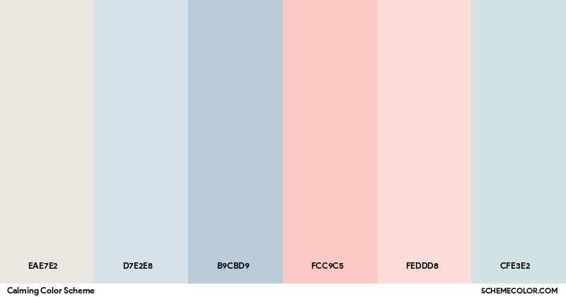
- Calming Spaces (Relaxation & Stress Relief): For a bedroom, meditation corner, or any place you unwind, stick to soft, muted tones and nature-inspired hues. Blues and greens are all-stars for calm. You might paint your walls a pale blue-gray or add decor in sage green, beige, and lavender. These colors cue your brain to relax, much like looking at a gentle sky or field(medicalxpress.com). Avoid jarring contrasts; instead, aim for a harmonious palette. Below is an example of a calming color scheme with gentle neutrals and pastels:
A calming color palette with gentle neutrals, dusty blue, and blush tones. Such soft colors have been used in spas and hospitals to reduce anxiety and foster relaxation. Try these hues in bedrooms or living rooms where you want to unwind.
- In practice, this could mean light gray or off-white walls (to create an open, airy feel) with accent pillows or curtains in pale blue. Add a few green plants for natural texture – the green not only looks calming but can improve air quality and stress levels.
- Tip: Use lower-intensity, matte colors for relaxation areas. Highly saturated or glossy surfaces in bright colors stimulate the eye, whereas matte and soft textures in cool colors help the mind rest. Even artwork can influence mood – a painting of a calm ocean in blue-green tones will make the space feel tranquil.
- Energizing Spaces (Productivity & Creativity): To boost energy in a home office, kitchen, or workout area, incorporate some vibrant, warm colors – but in moderation. A popular strategy is to use a neutral base (like white, gray, or a light tan) and then add pops of red, orange, or yellow to invigorate the space without overwhelming it. For example, a gray office with a bright yellow desk chair or bold orange artwork can uplift your mood and increase alertness on those drowsy afternoons. Red, as we learned, is a high-power color that can increase intensity and speed, so it’s great for a gym corner or any place you need a jolt of motivation. You can also mix in some contrasting fresh green or vibrant blue to keep a sense of balance (and to tap into the creativity and focus those colors support). Below is an example of an energizing palette:
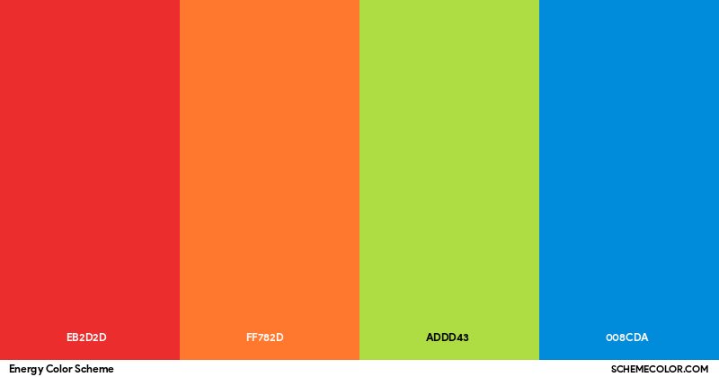
An energizing color palette featuring bold red, orange, lime green, and bright blue. Warm reds and oranges stimulate activity and appetites (ymega.com), while pops of green and blue add balance. Use these high-energy hues as accents in workspaces or exercise rooms to spark motivation. blob:https://chatgpt.com/4b241d48-fdfb-4cec-8a29-355279978bc5
- Think of a productivity palette like seasoning a dish – a little goes a long way. You might paint one accent wall in coral orange behind your desk to boost creativity, while keeping the other walls a calming white or light gray. Or place a red throw blanket and some yellow cushions in your living room for an instant lively vibe that encourages socializing. These touches can increase the room’s energy without making it chaotic.
- Tip: If you’re hesitant about painting or large commitments, start with accessories in energizing colors. Desk supplies, lamps, or even your laptop cover in a peppy color can inject energy into your workday. You can always swap them out if you find it’s too much. Also, leverage lighting – a warm-toned light bulb (more amber) can make colors appear warmer and more energetic, while a cool-toned bulb can subdue even bright colors.
- Balanced Spaces (Focus & Harmony): For areas where you want a mix of calm and focus – perhaps a study, library, or living room – consider a green-centric palette combined with wood tones or cool neutrals. Green is known to reduce eye strain (that’s why old library lamps are often green!) and can improve concentration over long periods. A forest green accent wall or emerald green rug can ground a space and make it feel scholarly and stable. Pair it with plenty of creams, soft whites, or light grays to keep the room bright and open. A touch of blue (say a navy bookshelf or a teal decorative piece) will add intellectual vibes without overpowering. The result is a space that feels fresh and alive (thanks to green) yet calm and orderly (thanks to the cool neutrals). This kind of palette is wonderful for a home classroom or office where you need to stay calm but alert. In fact, one tech company found that employees in green offices had higher perceived concentration levels than those in red offices – no one likes feeling “in the red” at work!
- Social & Appetite Spaces: For dining rooms, kitchens, or any entertaining areas, you can lean into warm, convivial colors. Earthy terracotta, golden yellow, burgundy, or peach can make a space feel welcoming and stimulate conversation and appetite. Restaurants often use these colors because they encourage people to feel happy and hungry (symega.com). If painting a whole dining room red is too intense, you can use red napkins, an orange centerpiece, or warm-toned dinnerware to get a similar effect. Candlelight (which casts a warm orange glow) also enhances warm color schemes and creates a cozy atmosphere. On the other hand, if you prefer a more subdued dining environment (maybe for elegant dinner parties), try a combination of neutral taupe or charcoal with small accents of plum or deep blue – the neutrals provide a sophisticated backdrop while the cool deep accents promote savoring and calm. Always consider the emotional tone you want: vibrant colors for a lively gathering, or muted cool colors for a calm, intimate meal.
Lastly, remember that personal preference trumps “rules.” If purple makes you insanely happy, don’t shy away from it even if it’s not common in a given space. Use these guidelines as a starting point, but always tailor your palette to colors that you love or that have positive meanings for you. The goal is to create an environment that supports the mood or activity you intend, be it restful sleep, productive work, or joyful entertaining.
Conclusion: Embrace Color Deliberately
Colors surround us constantly – in our clothes, homes, workplaces, and natural environment – influencing us in ways we might not always realize. The psychology of color teaches that by choosing our colors wisely, we can nudge our minds and bodies toward the feelings we desire. Want to feel more energized in the morning? Try adding a burst of sunrise orange to your kitchen. Need your bedroom to be an oasis of calm? Layer in cool blues, greens, or gentle neutrals and dim the lights in the evening. Feeling stuck creatively? A stroll through a verdant green park or a vase of bright fresh flowers on your desk might spark that breakthrough.
Pay attention to how different colors in your surroundings make you feel over time. You may discover, for instance, that you concentrate better with a bit of green in your line of sight, or that wearing a bold red outfit gives you an extra confidence boost on a challenging day. Our reactions to color are personal, but guided by universal human tendencies. By applying the research – and then listening to your own instincts – you can turn color into a simple yet powerful tool for mood management and well-being.
Call to Action: Take a look around your home or workspace and pick one small change to make with color. It could be painting a single wall, changing your phone’s theme, or buying a new throw pillow in a mood-boosting hue. See if you notice a difference in how you feel in that space over the next week. Share your observations with us or with friends – you might be surprised how much that “calming corner” or “energizing object” improves your daily mindset. Color is one of the easiest ways to design your life for the emotions and energy you want, so don’t be afraid to experiment. Open your world to a splash of new color – your mood may brighten in more ways than one!
(This post has been updated since its original publication to reflect current research.)